


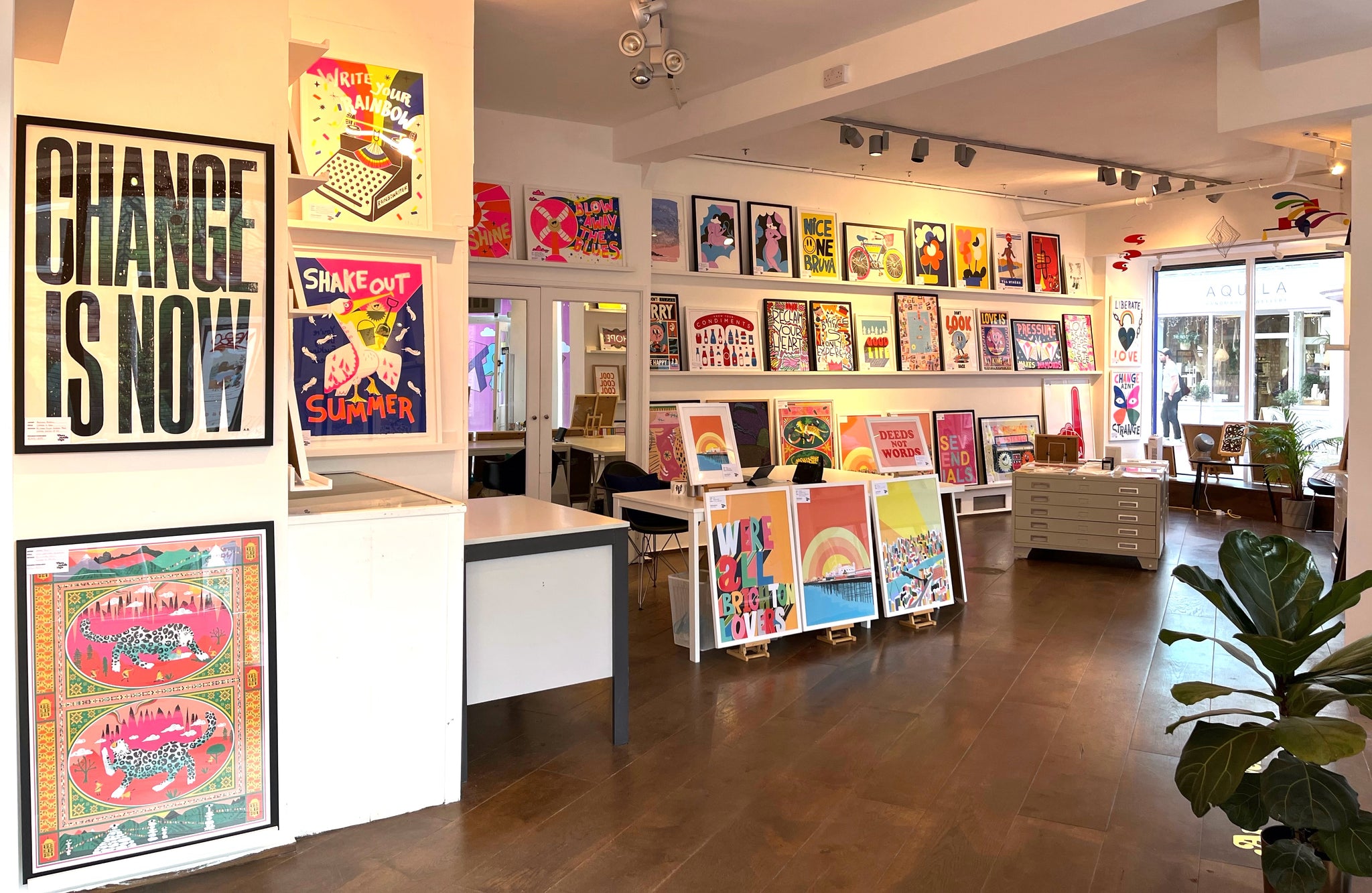

Welcome to They Made This
Home of the best and most affordable contemporary modern art prints.
Showcasing over 50 of the worlds top graphic artists and designers.
Curated by experts. Loved by all.
Start your collection now.

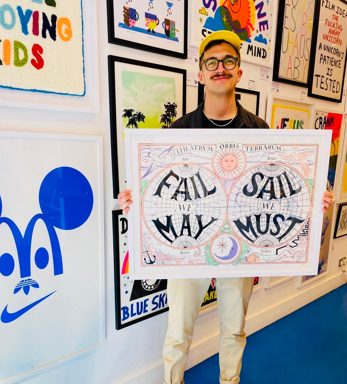

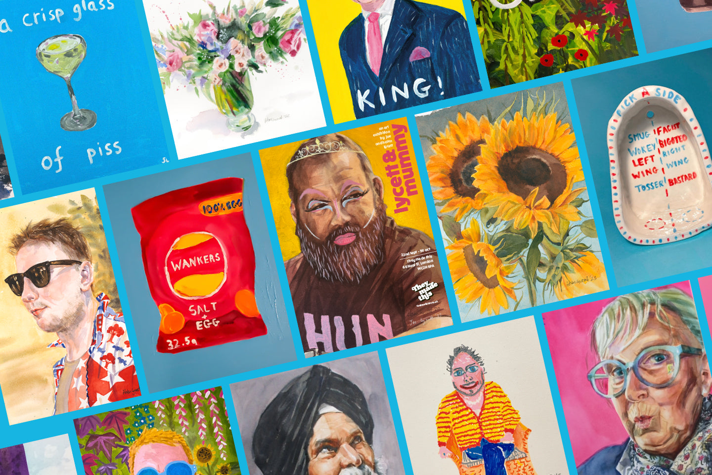
NEWEST ARTIST - NIA BEYNON
SHOP THE COLLECTION →


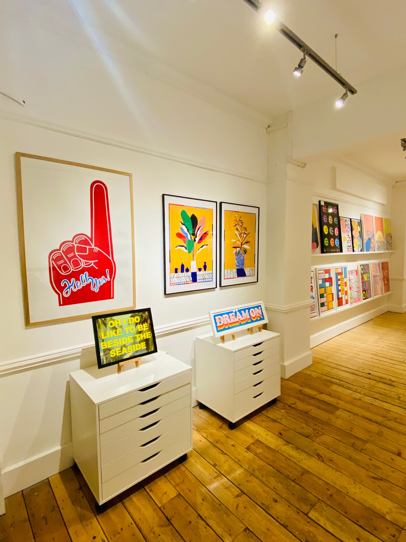
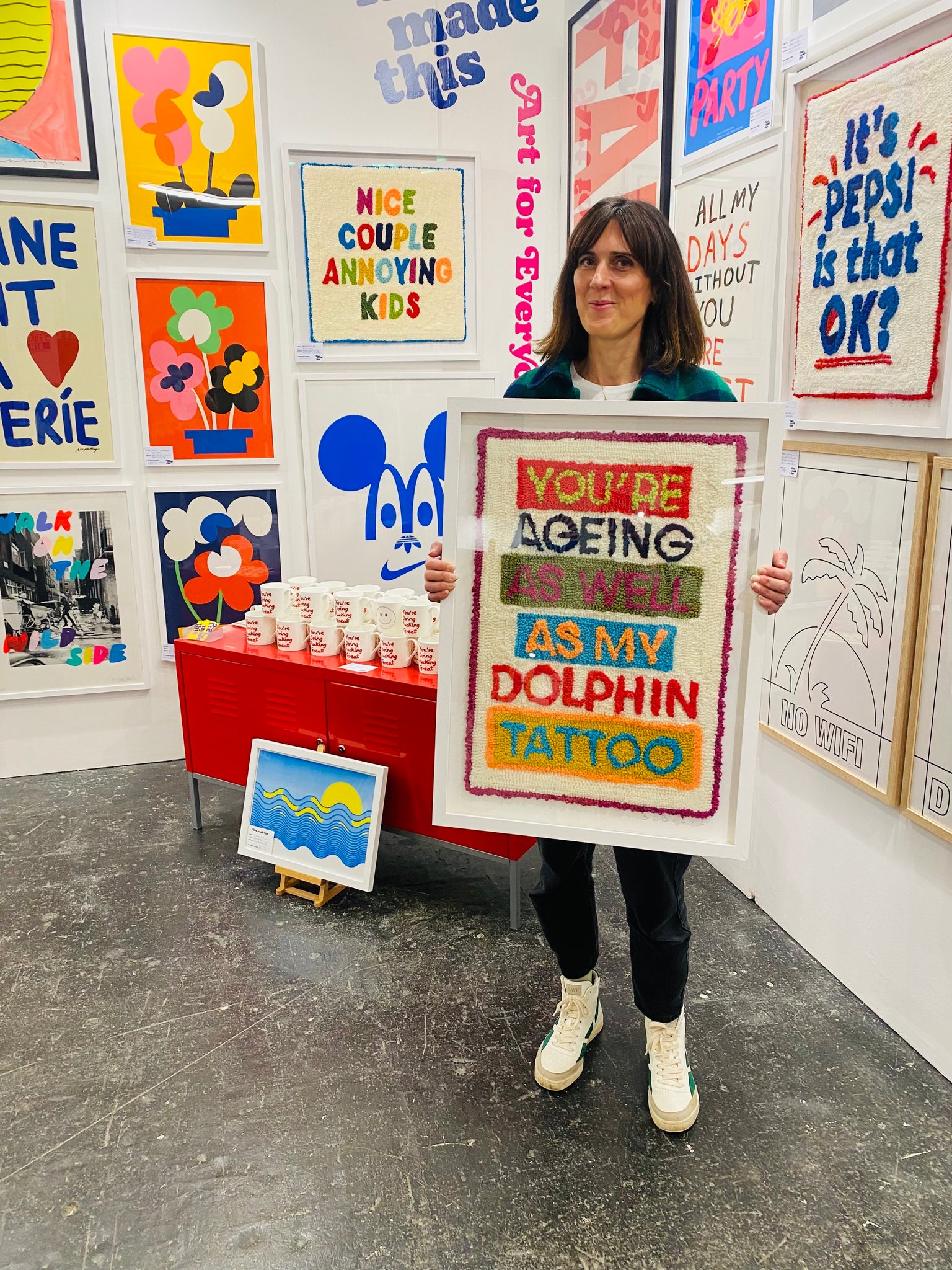
LIMITED EDITION PRINTS
Start your collection now with these exclusive curated artworks.
Limited edition prints →